In this article it talks about highlighting key words in paragraphs, using one major idea per paragraph, using bullet points, and using sub-headings. The biggest tip I think it gave was when it said that web writing should use half the word count as a regular document. I also thought this website offered good examples on how to narrow down and bullet point long paragraphs.
Wednesday, August 31, 2011
Writing For the Web
I thought that this article would be fitting because it deals with writing for the web and our first project is about paring down on writing.
Blacktop Creative's Legit Website
So this is probably one of the most entertaining sites I have ever visited. The intro screen is very interactive and the illustrated man speaks to you, even going so far as to tease you for hovering over the ‘simple site’ option instead of entering the ‘awesome site’ that is full of animation and goodies. Also, I left this page up by mistake and if you leave the man alone long enough he will start singing to you. Once you are into the ‘awesome site’ it gets pretty interesting to navigate. I think this is a good example of how some sites are meant to be more intricate and interactive. Overall this is a fun website and you will want to click on everything to see what can possibly happen!
(Oh, and did I mention this is in Kansas City? They combined with Barkley. How neat is that?)
- Julie
10 Great Sites [by Julie]
10 Great Websites:
- Kraken Rum Website: http://www.krakenrum.com/
- Liquid9 Production & Post agency in KC: http://www.liquid9.tv/
- Advertising Federation of KC (well organized!) http://aafkc.com/
- AIGA’s Design Envy Site (Clean blog style) http://designenvy.aiga.org/
- Pixar Studios (fun, simple, easy to navigate) http://www.pixar.com/
- http://mariecatribs.com/ (playful restaurant site)
- http://www.g2geogeske.com/ (no scrolling, and still effective!)
- http://www.infinvision.com/ (check out element that pops up on the bottom right of the screen when you scroll!)
- http://www.wearableprint.co.uk/ (interactive, simplistic)
- http://bloominteriordesign.com.au/ (simple, elegant interior design site)
Although this is a little hard core for class, we are all college students that would probably relate to this link. Not knowing anything coming into Digital Environment, I still have a hard time knowing what everything is. This link, however, was a humorous way to explain UI and UX in the digital world. Hope you guys enjoy it and learn something from it just like I did!
http://www.youtube.com/watch?v=2wZUTe70w1Y&feature=related
Tuesday, August 30, 2011
Clubhouse Rules
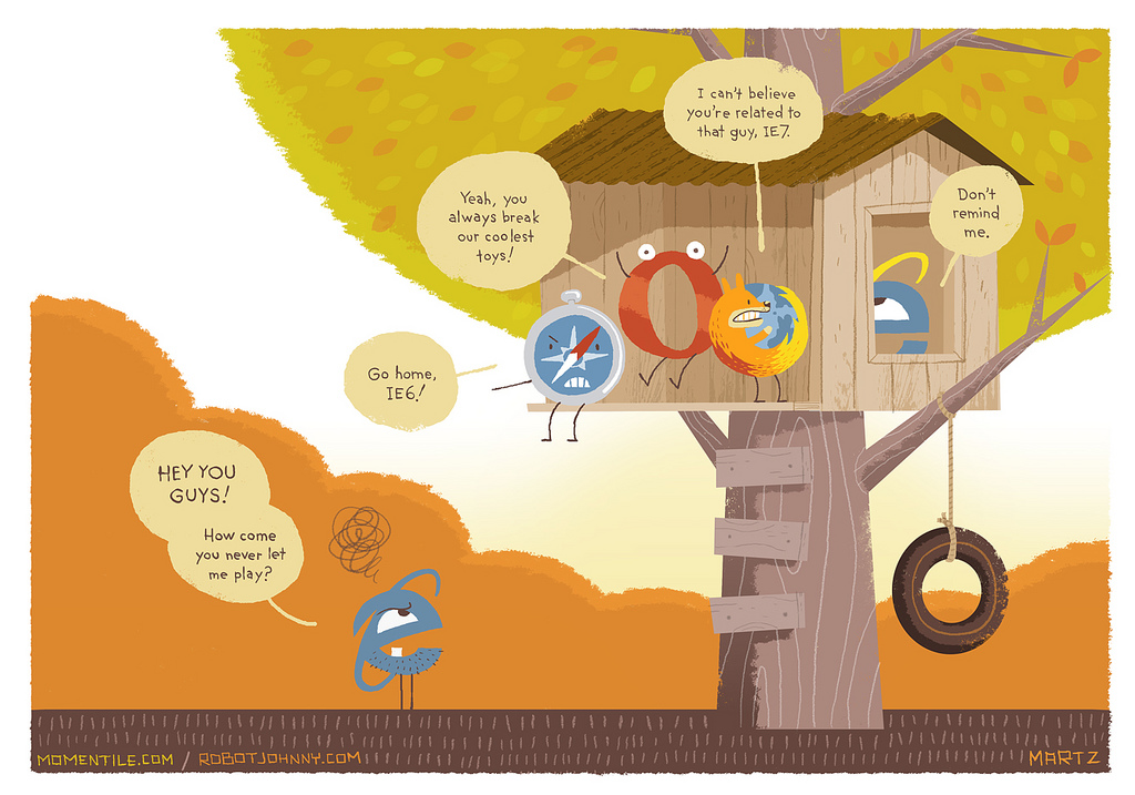 I must say that I am surprised that Internet Explorer 7 is even allowed into the clubhouse. Over the years internet explorer has always had the most issues and even in most cases HTML has to specifically added into the coding in order for internet explorer to read a page. I have used Firefox and more recently Google Chrome for 90% of my computer usage since i was a kid and have had far fewer problems than I have had with IE. The joke i always say is that Internet Explorer is only used to download Firefox or Google Chrome onto a new computer, and than it's forgot about.
Monday, August 29, 2011

Saturday, August 27, 2011
The User Experience
Web Design in 2011
The article, Web Design Trends in 2011, discusses important changes occurring in web design, According to the article, some of the ways to keep sites up to date with new trends in technology include making the site mobile ready, designing for touch screens instead of mice, and incorporating thumbnail design into sites. Also, the article presents new trends in web design and ways to keep sites user-friendly in 2011, such as creating simple color schemes, incorporating depth perception into designs, and using large photographic backgrounds.
Newest Trends and Applications for Web Design
This site explains all of the new trends surfacing with web design. Web Design is a constantly evolving field but the article really stresses that changes have be even more rapid than usual in the past year or so with all of the new touchscreen technology, along with the fact that one has to keep in mind that there are all types of screens in different shapes and sizes. The article also includes many examples of good design with all of the different interfaces used today.
Hierarchy in Web Design
What I've found has given me the most trouble in the past when designing for the web was hierarchy, and designing a site that was easy to flow through that placed the emphasis in the places it needed to be. It's actually got some big differences from print designing and can make or break your site.
I found this website that shows you how to use color, dimension, size, placement, and contrast to make elements of your page stick out or recede. It shows some great examples of using these elements and how successful it can be. It's very interesting to see how using a good sense of hierarchy can de-clutter a page and make it much more pleasant to take in.
Enjoy:
http://www.onextrapixel.com/2010/06/24/a-closer-look-at-hierarchy-in-web-design/
Website Navigation
While browsing this website I found some helpful stuff on webdesign. This particular page helps to understand easy format for navigation that will allow your viewer to move fluently through whatever information is posted. I see this as an important tool.
http://www.rocketface.com/organize_website/website_navigation.html
http://www.rocketface.com/organize_website/website_navigation.html
http://sixrevisions.com/web_design/250-quick-web-design-tips-part-1/
I found this page to be interesting and caused me to think about things that I hadn't previously thought about. I think that this is a helpful site in general for web design. I think these tips could be really helpful to us down the line when we become more proficient.
Tizag.com

Hi! I found this great site that provides hand coding tutorials! It is a bit like W3schools. com but it also provides other tutorials from Microsoft Office to photoshop. It also has forums where you can post a specific question and it will be answered. I just thought this could help us out this semester. Just go to tzag.com to check it out!
8/27/11 assignment
The video I have posted comes from vimeo.com and is titled, “UX Week 2009 | Jeffrey Veen | 5 Minutes on Imitation in Design.” The video itself I believe is relevant to both design and web design in that it talks about copying vs. inspiration. One on the examples Veen touched on was the UI of the iphone and how, after its great success, other companies with similar products imitated the iphone’s UI, with the belief that they would have the same success. He also points out examples where source code has just been copied and pasted. Veen’s basic message is that one should understand why something works, then take inspiration from it and make it one’s own.
http://sixrevisions.com/web_design/how-to-design-for-your-worst-client-you/
Some good tips for designing for ourselves. I think all of us can relate to this.
Some good tips for designing for ourselves. I think all of us can relate to this.
This is a site about website rules that should sometimes be broken. As designers we are subject to design rules regardless of whether we are designing for the web or for print. As we grow in our design skills we should try to break these rules to a degree, but not go so far that it would compromise the design or the structure of the piece we are designing for.
I found this video talking about different websites and what does and doesn't work with their design. I'm sorry to say that the video is ten minutes long but really its not hard to watch and gives several examples. The first site he mentions is the Google homepage. Since we talked about this in class I thought it would be good to go a little deeper into its design elements. He also explores a few online portfolio sites I thought might be good to listen to considering we'll be create our own in this class (or so I've heard). The narrator also shows a few bad example of what you shouldn't do. Most of what he says is very basic but since this is our first web design class I figured it would be a good video to steer us in the right direction.
http://www.youtube.com/watch?v=HX0y7fe2ndk&feature=related
Web Design Trends 2011
I ran across this neat article recently and thought it would be an appropriate blog post. I know many of us are new to the web design world, so it is important to know what is popular and how other designers are executing their sites. I found this particularly interesting because many of these trends are parallel to the print design world. Although this is an incredibly long page of information, I would highly recommend scrolling through the entire page and taking a look at some of the examples.
Friday, August 26, 2011
The link posted is a short and sweet video that explains the UPS principle. I liked how the point of this video was to K.I.S.S. and thats what they did. By keeping the video short and simple, I was able to understand exactly what they were trying to get across.
The UPS principle is something I think might sometimes get overlooked. U being users, P being purpose and S being simplicity. By understanding and remembering who your target audience is then you should design the purpose towards their needs. Keeping it simple is great too because way to many of these websites can be overwhelming and not very user friendly which would be a huge turn off for most of the audience that would rather not spend so much time just trying to figure out how to get started.
-Maleri Malekyar
While researching web design, I stumbled upon a website that talks about a visitors first impression on your website. I think that this is a very important attribute to consider while designing your site. Things such as load time, making sure the material is user friendly etc. I think any good designer should know the basics of good design. It's important to keep these in mind while creating a website. There needs to be visual hierarchy, a pleasing color palette, and organized layout.
Of the above things, I think that user friendly is such an important thing to keep in mind. As designers, we're obviously going to pay attention to color, layout, etc. But we need to remember that our sites need to keep people interested and coming back.
Interactive Timeline Personal Scrapbook (StoryVerse)
This is a website, where you can keep track of what was happening in your life. This is based on where you were in your life, and what was happening politically, culturally, and economically. There is also a chat option, where you can talk to people that have similar events in common with you. You can keep track and add people as well. I thought this was a cool way to see how you personally fit in to the world around you and relate to others.
University Websites
Its true that most main website pages contain the information that makes the page look appealing and not necessarily the information we goto the website for. But i must say that KSU has a few more of the common interests than others.
http://xkcd.com/773/
Subscribe to:
Comments (Atom)